
Autonomy, Mastering the Flow of Global Investment
Brand design, Logo design, Brand architecture, Naming
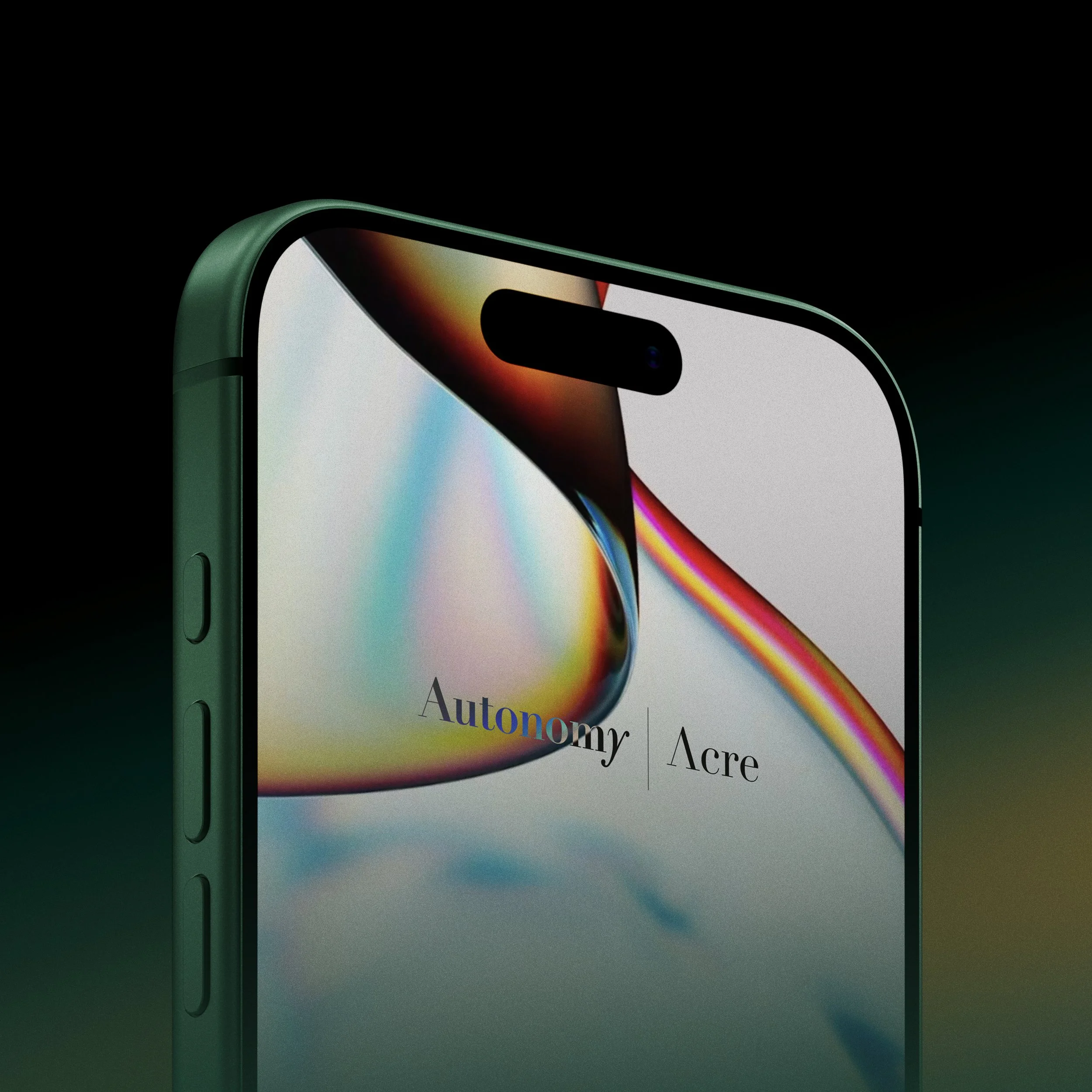
True independence is not about resisting the current; it’s about mastering it. For Autonomy’s strategic rebrand, we developed a visual and conceptual identity built on the metaphor of water, a force that adapts, reshapes landscapes, and moves with quiet, transformative intent.
Navigating Complexity with Elemental Brand Architecture
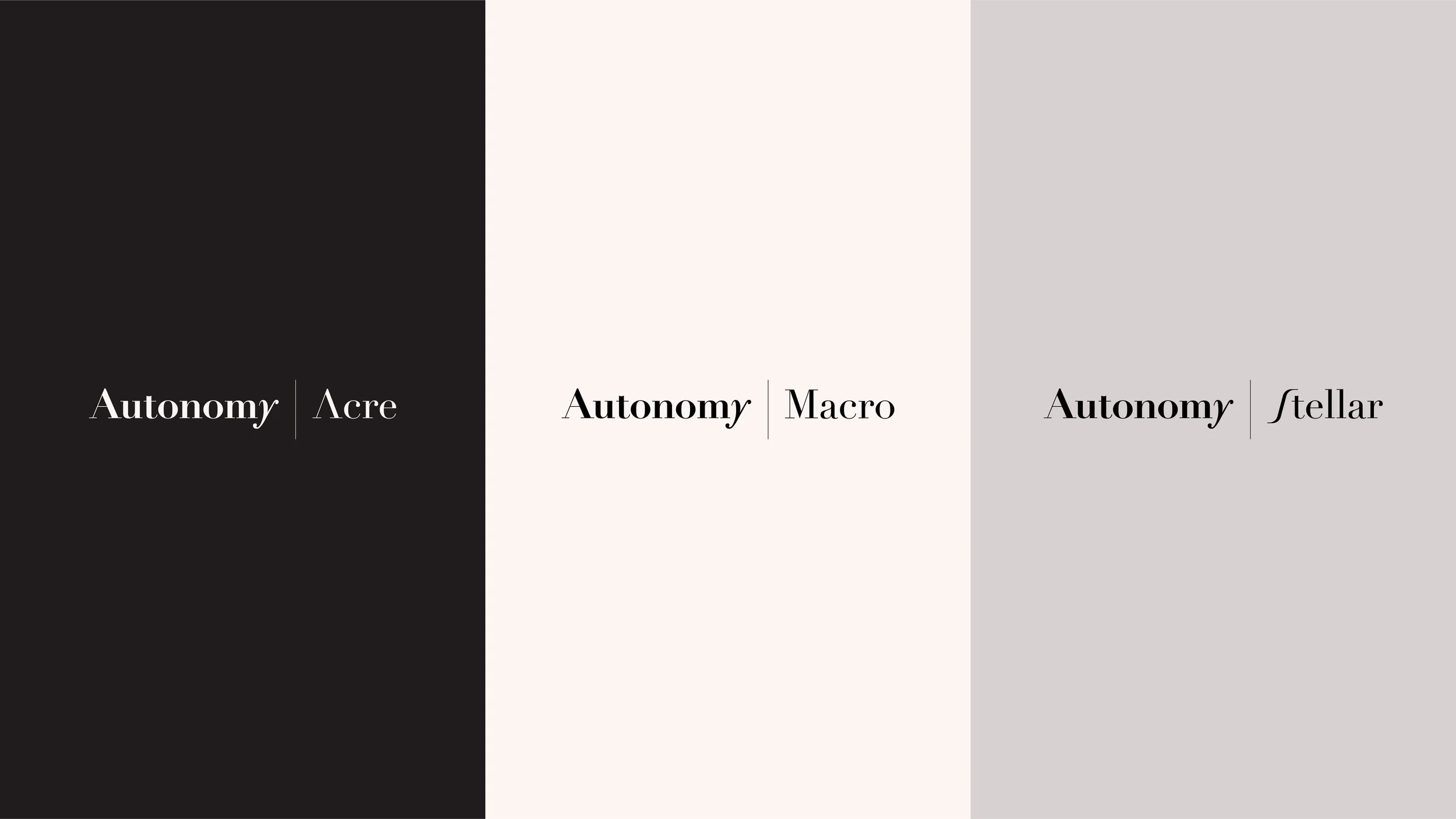
Beyond a new visual identity, our work focused on creating a clear, sophisticated brand architecture that gives each of Autonomy's divisions a distinct voice while maintaining a unified core. We led the naming strategy and identity design for three key pillars:
Acre: Grounded and tangible, anchoring their real estate strategies.
Macro: Navigating global opportunities across public markets and thematic investments.
Stellar: Looking outward toward the frontier technologies and energy systems of tomorrow.
A Unified Strategy from Naming to Digital Design
From brand strategy to digital design, the rebrand expresses Autonomy’s ability to identify independent paths to long-term value. As a boutique design agency, we worked closely with their leadership to ensure that every element, from the logo design to the broader brand world, reflects a firm that flows beyond conventional channels to generate real impact.


Credits
Creative Direction:
Yarza Twins
Brand Design:
Eva Yarza, Marta Yarza
Web:
Dgrees Studio
Brand Voice:
David Ventoso, David Mouriño
Services


Not sure where to start?
Most of our clients begin with Branding or Web and expand from there. We’re here to help you figure out exactly what your brand needs to thrive. We pride ourselves on being adaptable, whether you’re a boutique startup or an established name; we offer scalable solutions designed to fit different goals and budgets without ever compromising on aesthetic quality.