Egypt, where ancient echoes meet a vibrant, modern pulse
Celebrating Timeless Charm and Vibrant Spirit.
Rebranding a country like Egypt isn't just a job; it’s a massive, exhilarating challenge that we jumped into with all our hearts. Working alongside the team at Something More Near, we wanted to move away from the clichés and show the world the Egypt we see: a place where 5,000 years of history live side-by-side with a buzzing, modern energy.
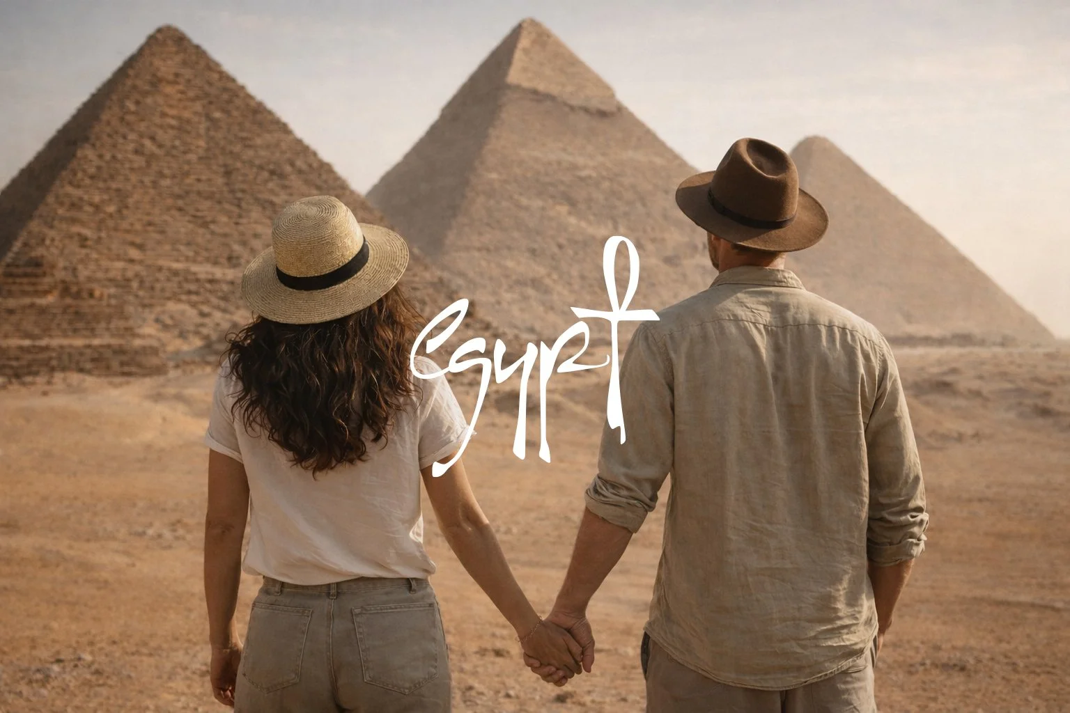
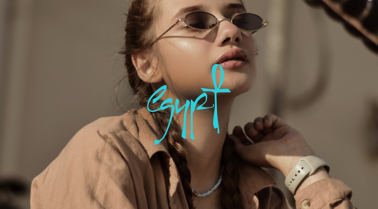
A logo with a secret heartbeat
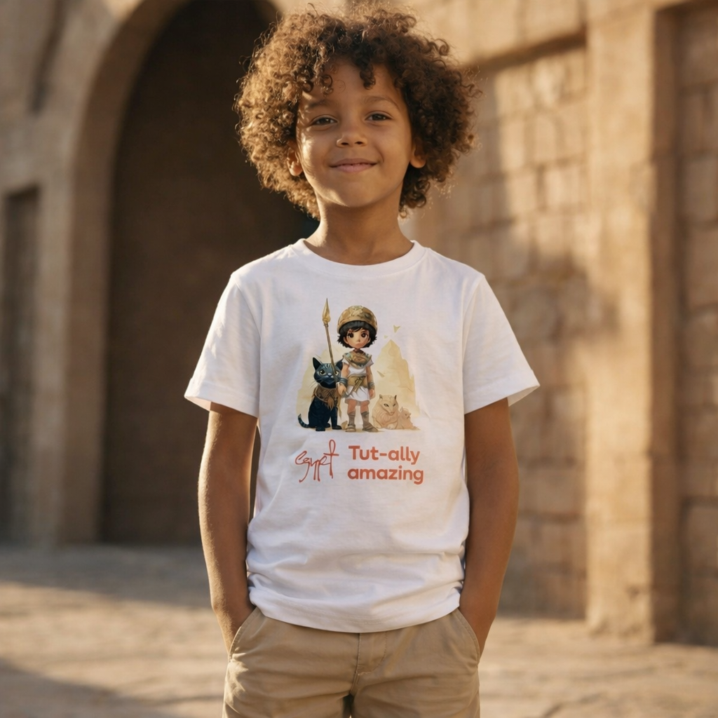
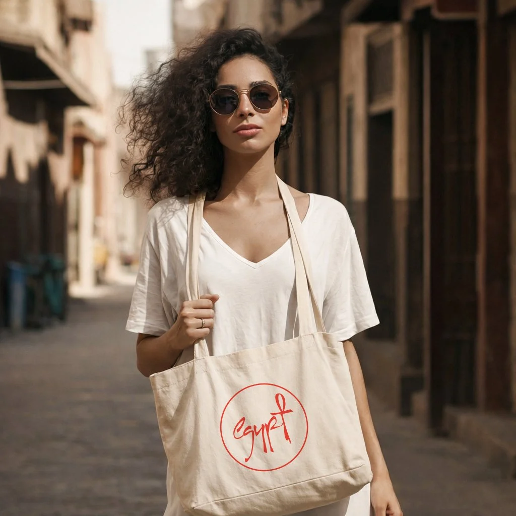
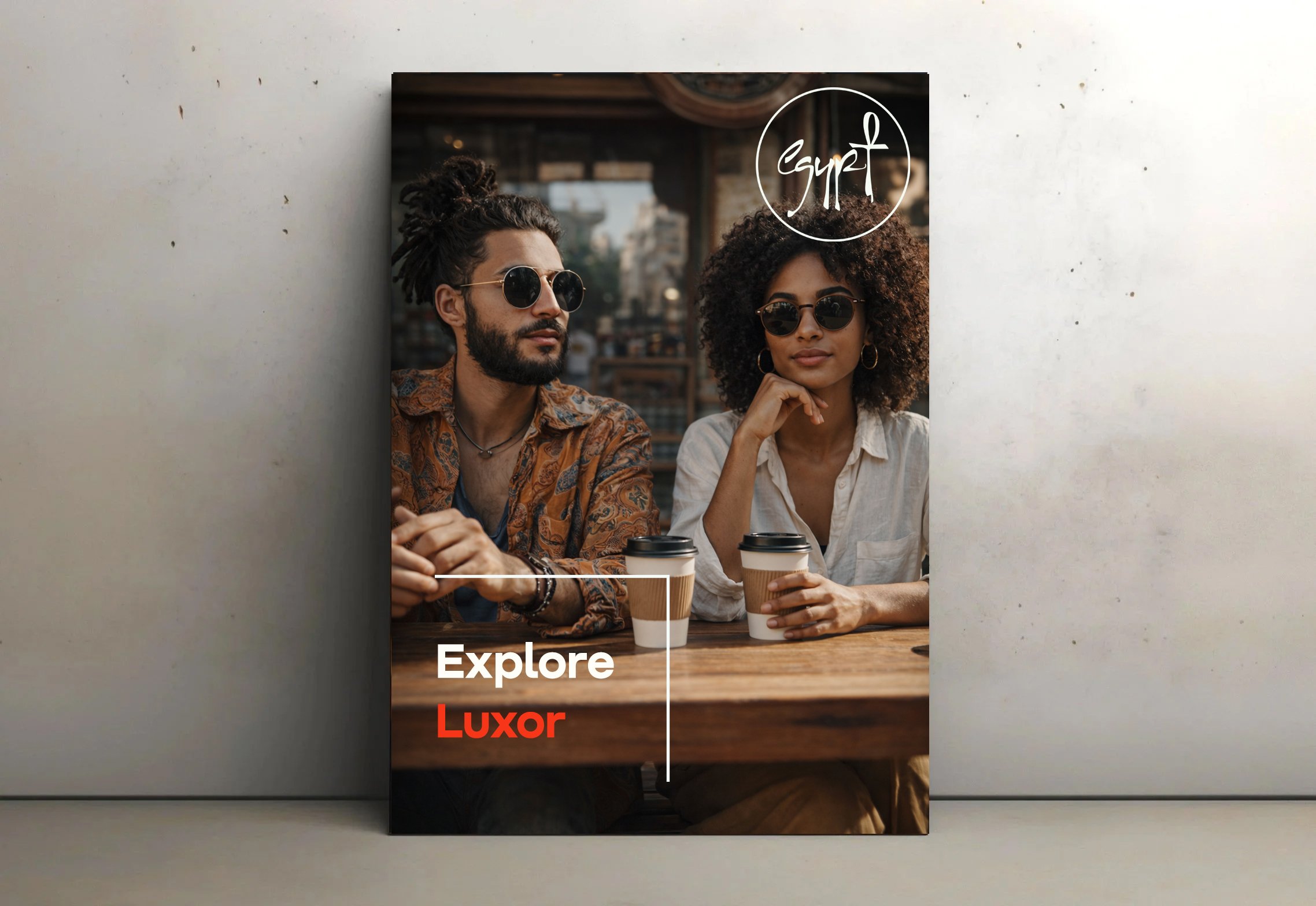
We obsessed over the details. At the core of the new identity is a custom font we designed to feel both solid and fluid. Look closely at the logo, and you’ll see the letter ‘T’ gently transform into an Ankh, the ancient symbol of life. It’s our way of connecting the past to the present in a single stroke, making the brand easier to read without losing that unique Egyptian soul.
Colours of the Earth and the Sun
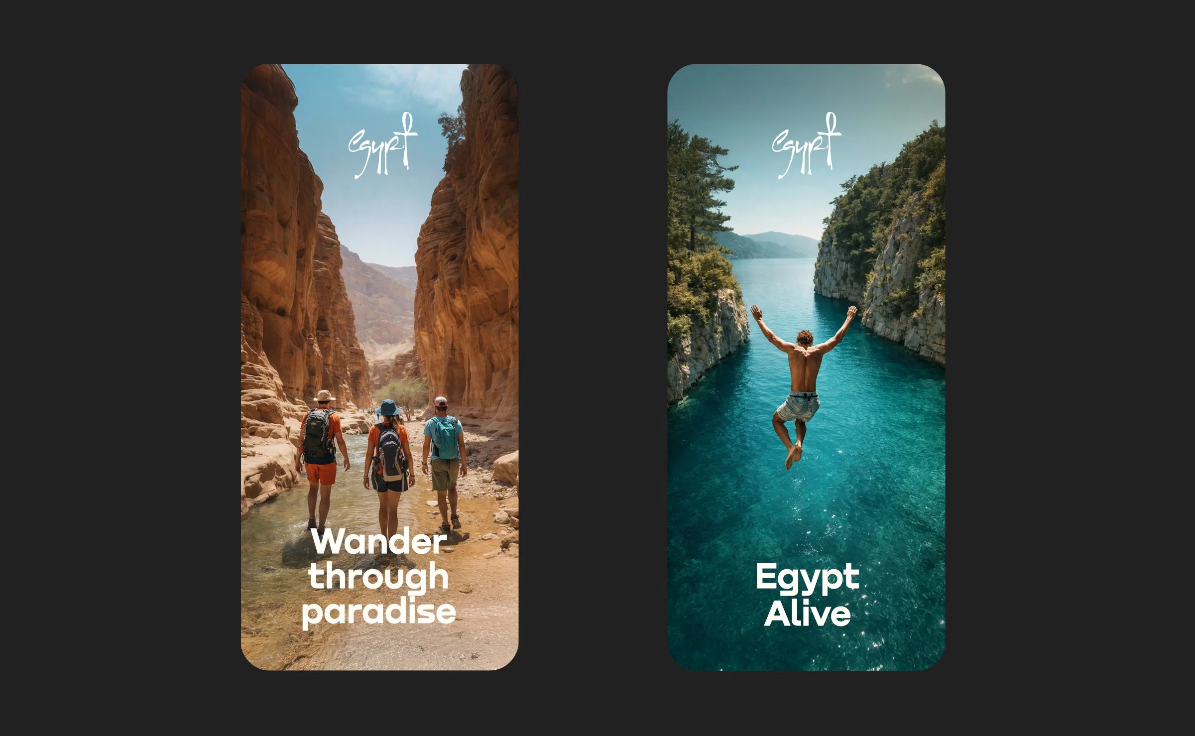
Our palette wasn't picked from a book; it was inspired by the sand, the Nile, and the vibrant street art of Cairo. We didn't just want to "rebrand" a nation; we wanted to celebrate its eternal charm and that unstoppable, creative spirit that makes Egypt unlike anywhere else on Earth.
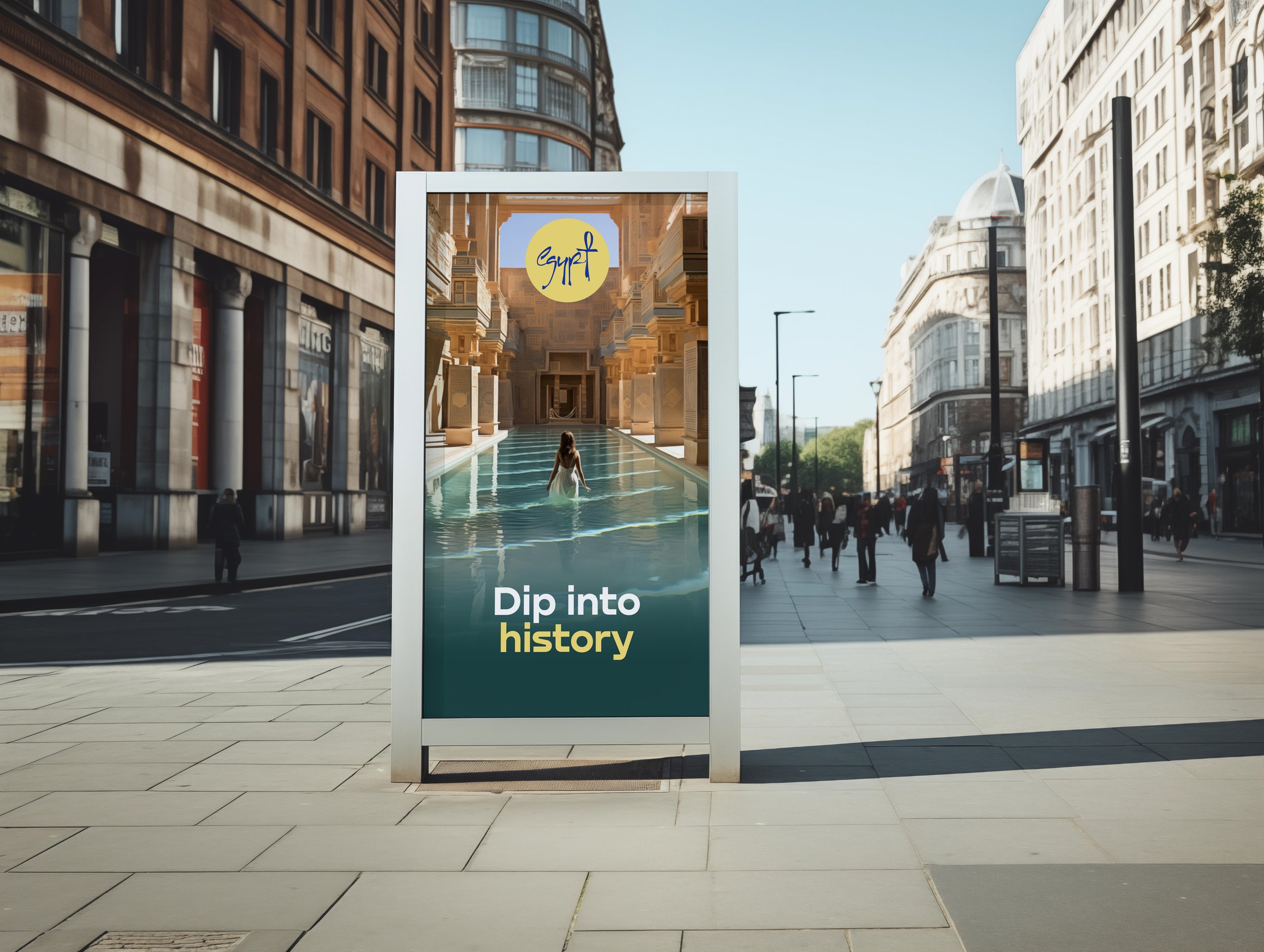
Impact
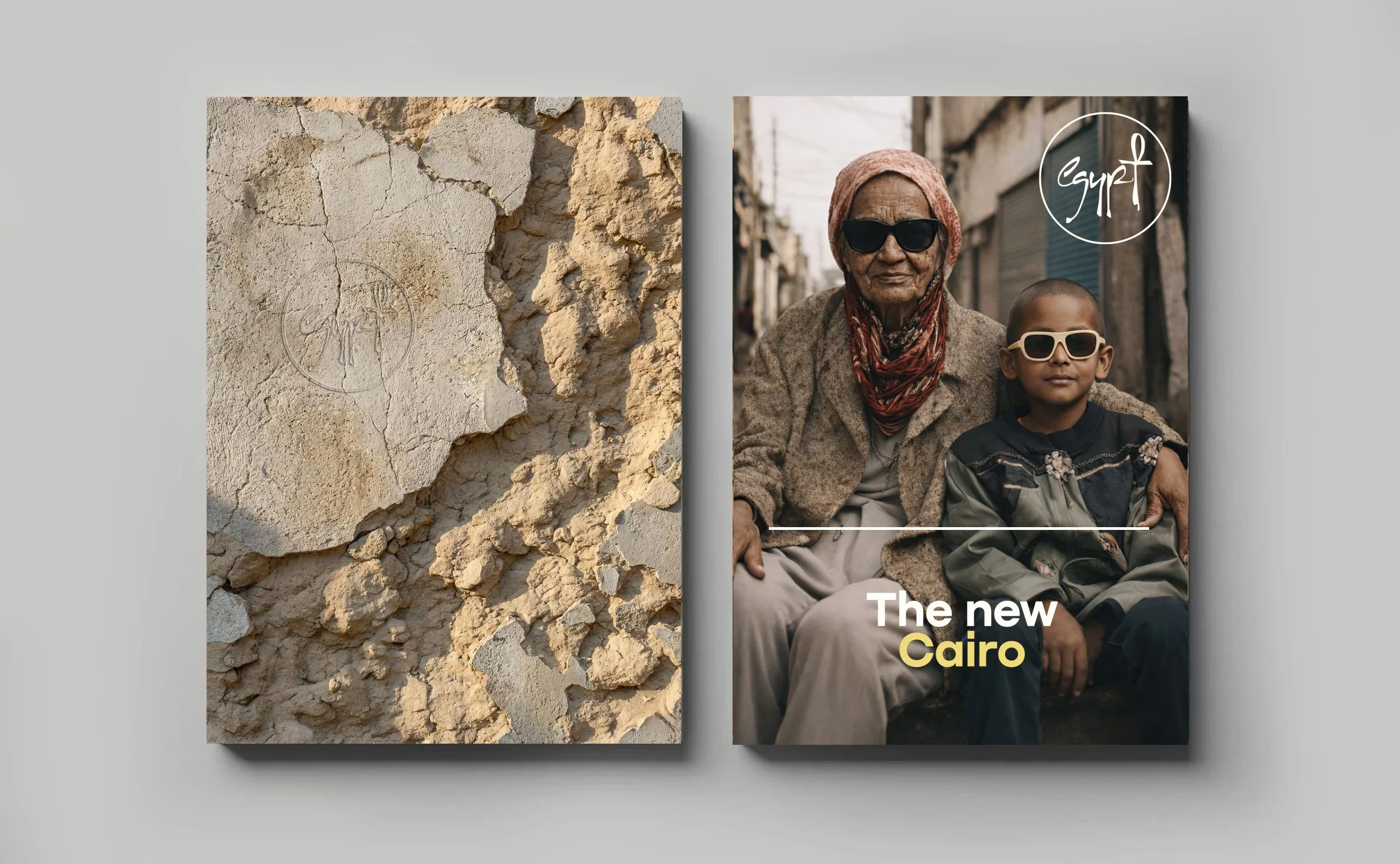
Commissioned by Egypt’s Ministry of Tourism and Antiquities as part of the country’s official tourism identity, the Experience Egypt rebrand supports a national platform designed to present the destination beyond its ancient icons, from culture and heritage to nature, cities and contemporary travel experiences. Since the identity launched, Egypt’s tourism sector has continued to gain global momentum, reaching record visitor numbers and becoming part of a wider national ambition to grow tourism to 30 million visitors annually. The result is a flexible destination brand built for one of the world’s most recognisable countries, at a moment of renewed international attention.


The beautiful sunsets and coral reefs
The first pigment, invented in Egypt thousands of years ago

The gold of the majestic Pharaohs
To reflect the Red Sea


Credits
Design:
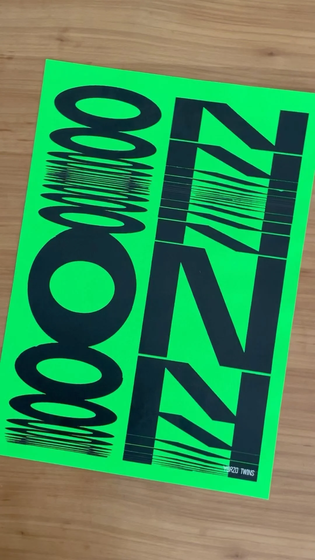
Yarza Twins
Logo typography:
Yarza Twins
Typography:
Denis Serebryakov, Type Today
Strategy:
Something More Near
Production:
Something More Near
Brand voice:
Something More Near
Photography:
Ahmed Hassan, Amina Mahmoud
Web design:
Yarza Twins, Hoda Ali
Services


Not sure where to start?
Most of our clients begin with Branding or Web and expand from there. We’re here to help you figure out exactly what your brand needs to thrive. We pride ourselves on being adaptable, whether you’re a boutique startup or an established name; we offer scalable solutions designed to fit different goals and budgets without ever compromising on aesthetic quality.
FOLLOW US ON INSTAGRAM