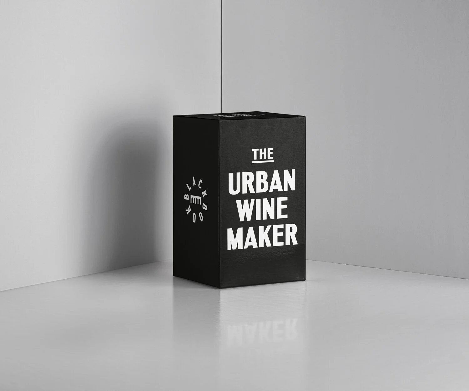
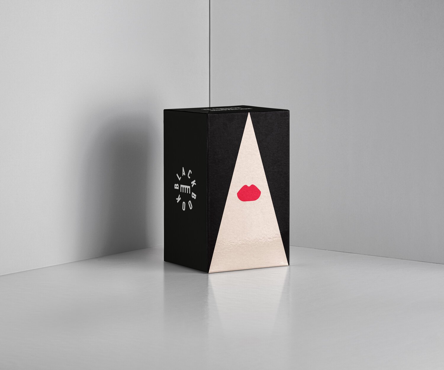
Black Book, bottling London’s Urban Spirit
Blackbook Winery.
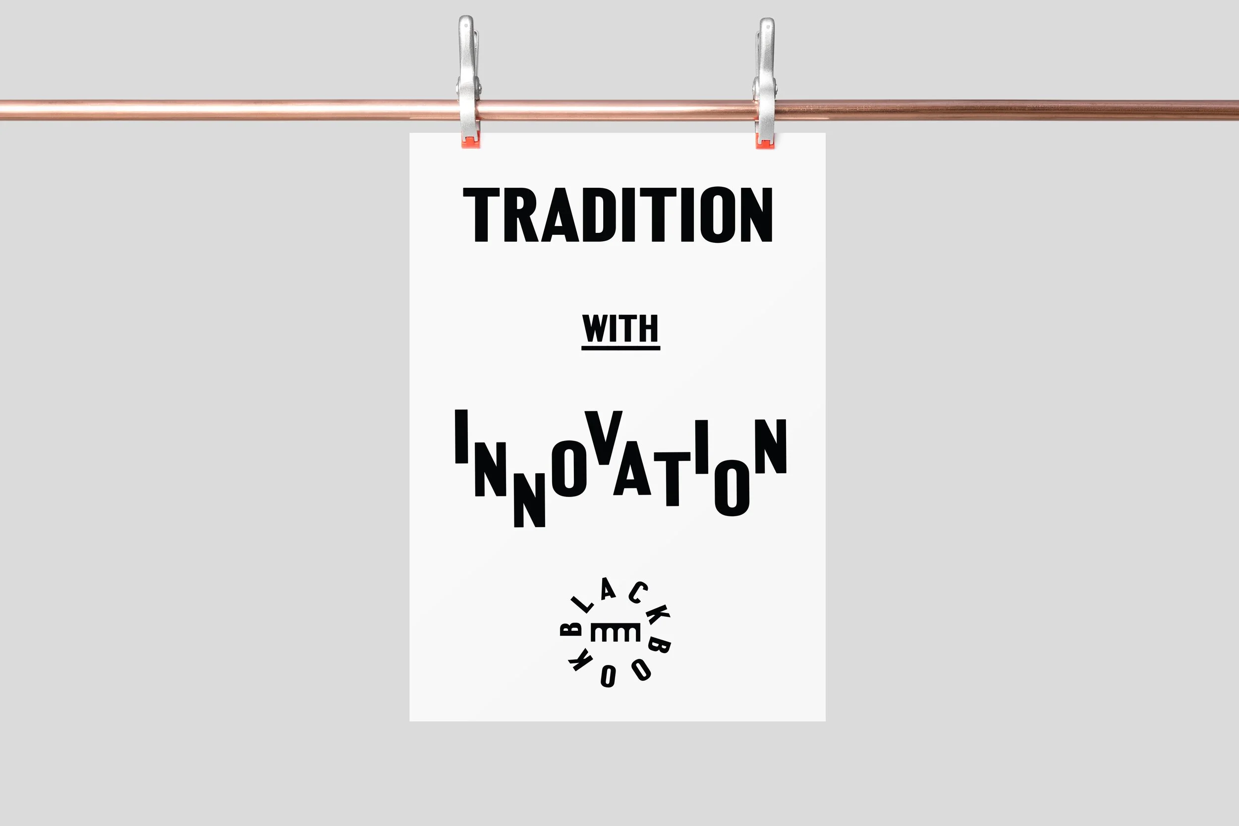
Tradition with a twist: Design for an urban winery
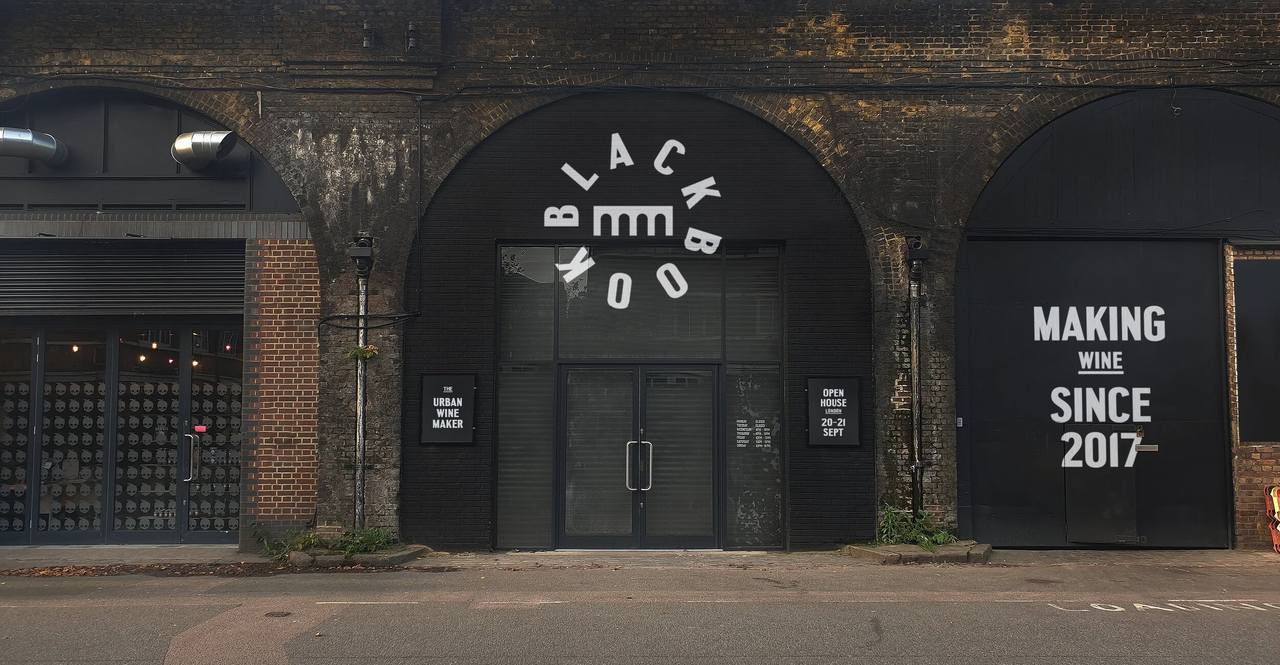
Nestled under the historic train arches of Battersea, Blackbook Winery is doing something truly special. Their mission is to put British wine on the map by blending "Tradition with Innovation." When they asked us to create their brand identity, we knew we had to design something that felt as modern, urban, and proudly British as the wine itself.
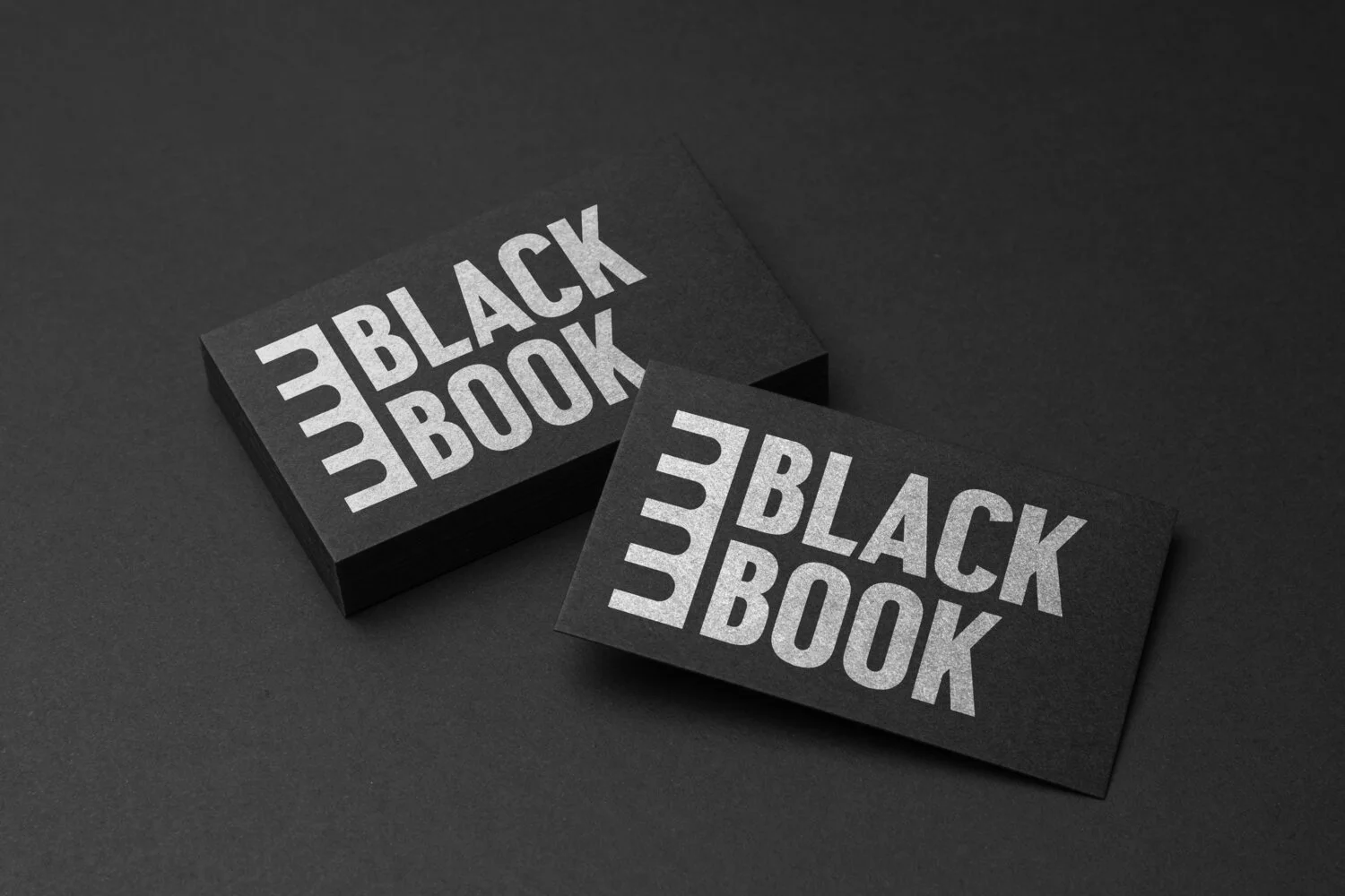
A logo that tells a story of place
We wanted a mark that felt like an invitation to a story. The logo design we crafted features an intertwining "B" that subtly mimics the pages of an open book, while also echoing the iconic architectural arches of their London home. It’s a balance of heritage and contemporary craft, clean, bold, and memorable.
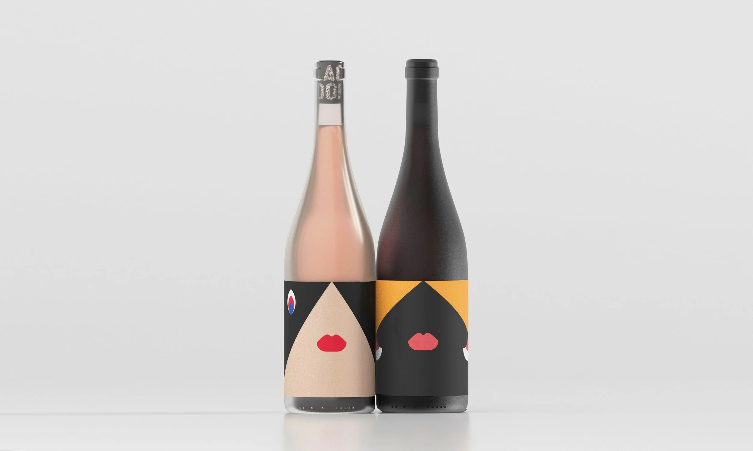
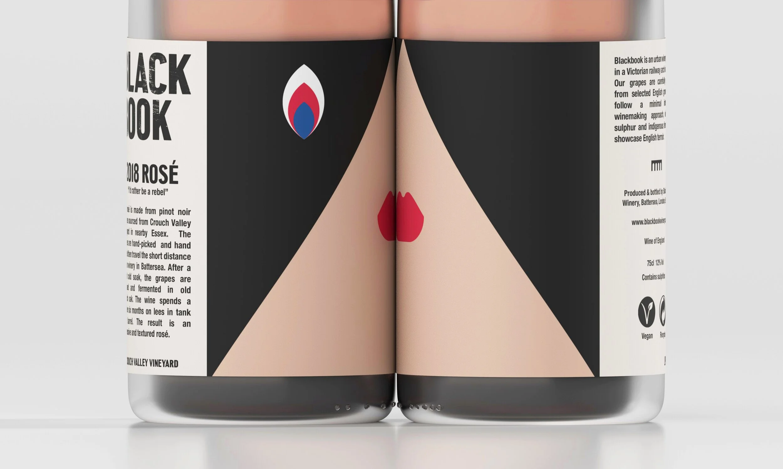
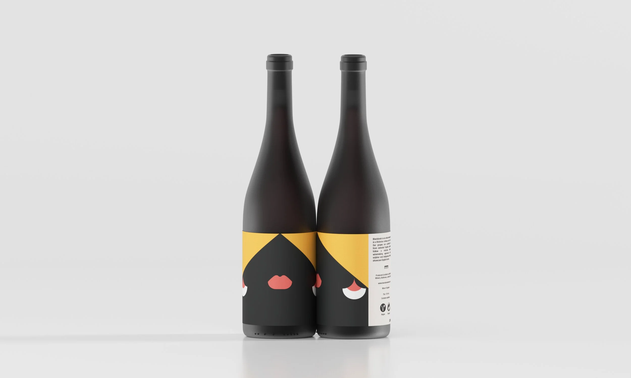
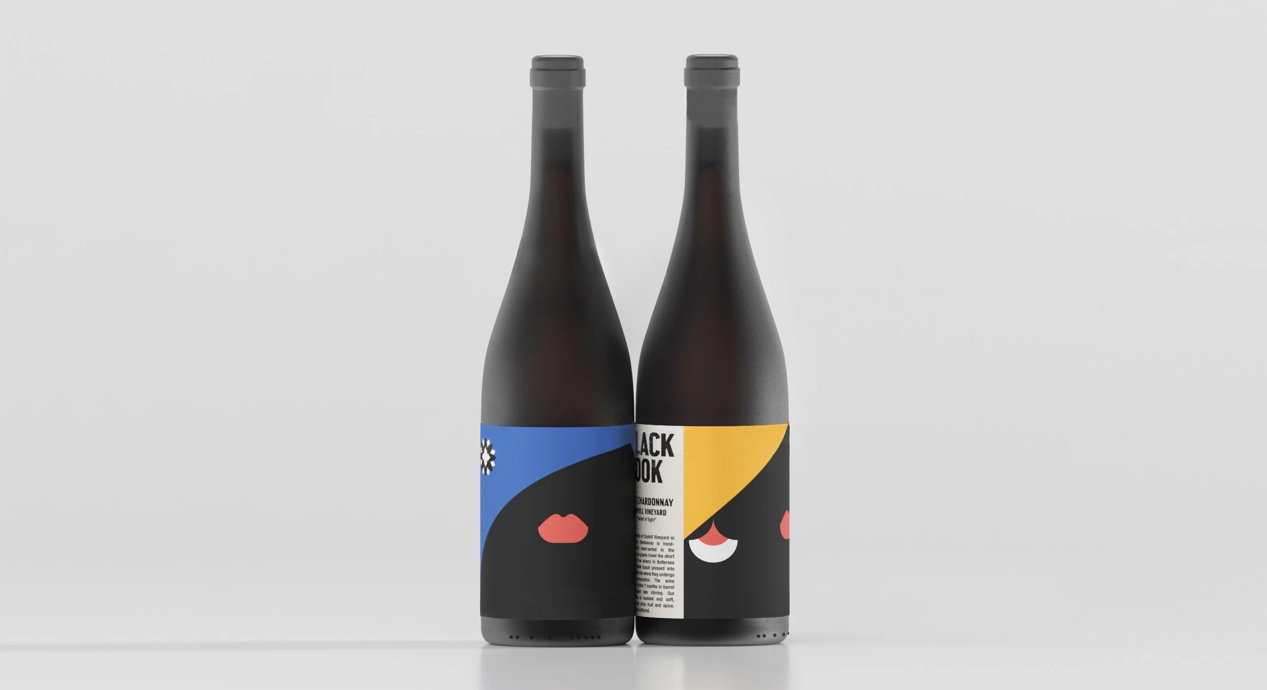
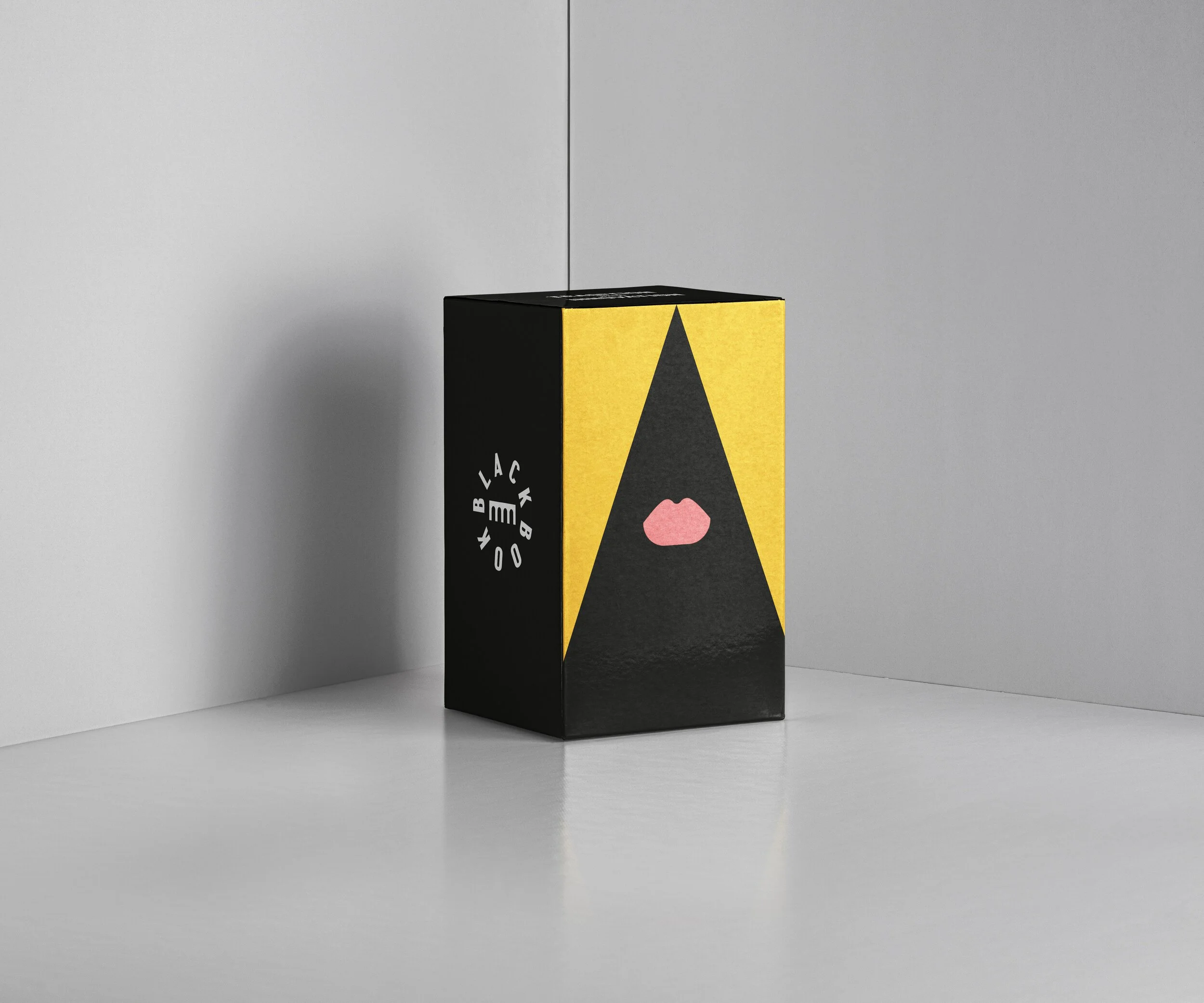
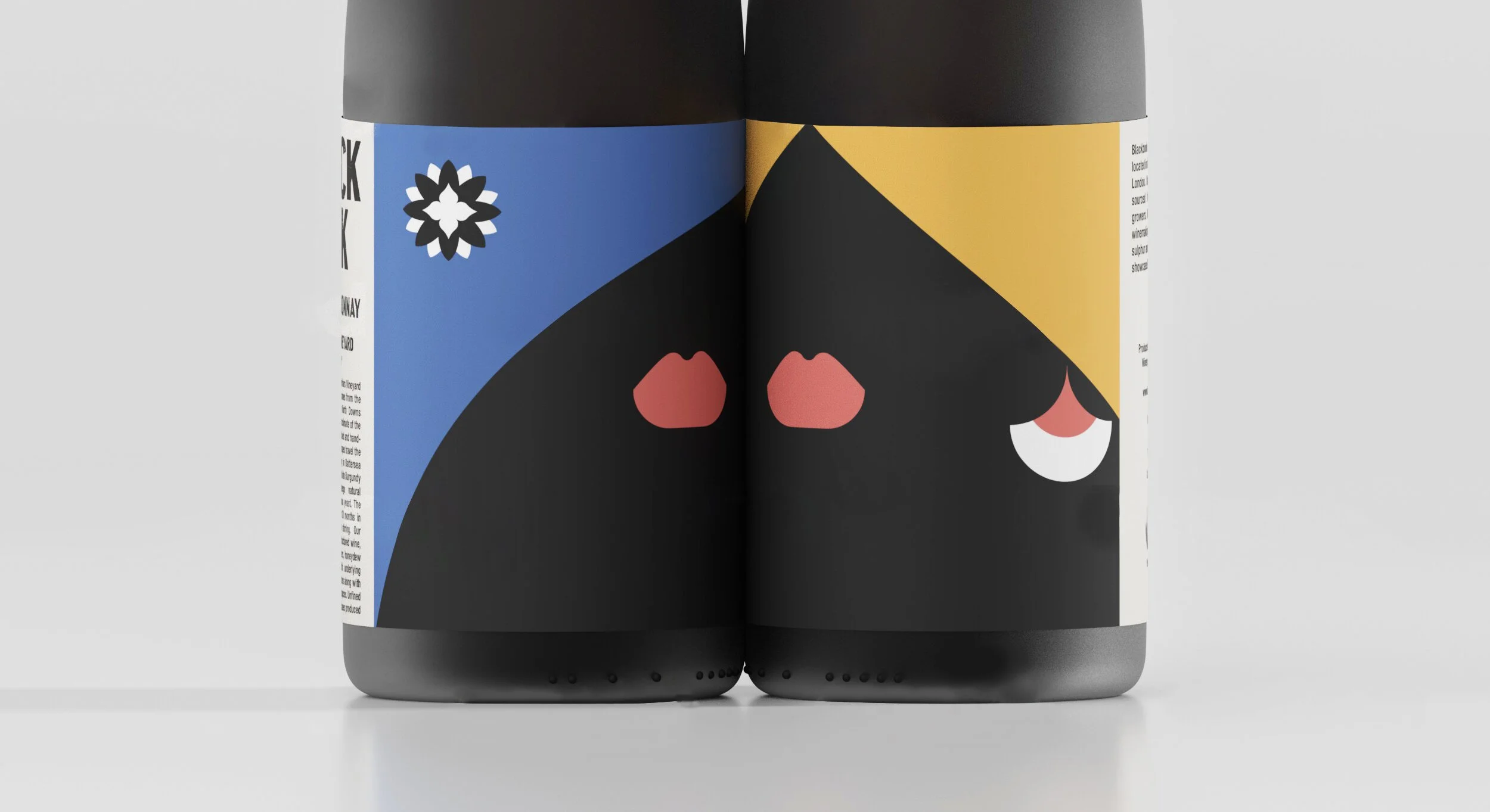
Art on a bottle: Labels inspired by London’s culture
Each label we designed is a tiny masterpiece, a tribute to the city that defines the brand. Our packaging design doesn't just decorate the bottle; it starts a conversation:
The Rosé: A powerful tribute to the Suffragists, featuring an illustration where the hair flows like the flames of a factory facade, a symbol of the women who changed London’s workforce forever.
The Chardonnay: A celebration of London’s vibrant immigrant communities and artistic heritage. We hid "Easter eggs" in the design, like geometric earrings inspired by the floors of the Tate Britain and flowers from the Royal Opera House.
Bringing values to life, one bottle at a time
This collaboration is the perfect example of how effective packaging can do so much more than hold a product, it shares a brand's values. By weaving London’s history into the visual language, we helped Blackbook share its heart with every pour. It’s a project that shows why we love what we do: turning a brand’s story into something you can hold in your hand.
Impact
From an ambitious London startup to one of England's leading urban wineries, Blackbook has built a reputation for exceptional winemaking and bold creativity. Today, its wines are stocked by retailers such as Fortnum & Mason, Harvey Nichols and Wine Republic, with multiple WineGB Awards recognising the quality of its wines and craftsmanship.
Credits
Creative Direction:
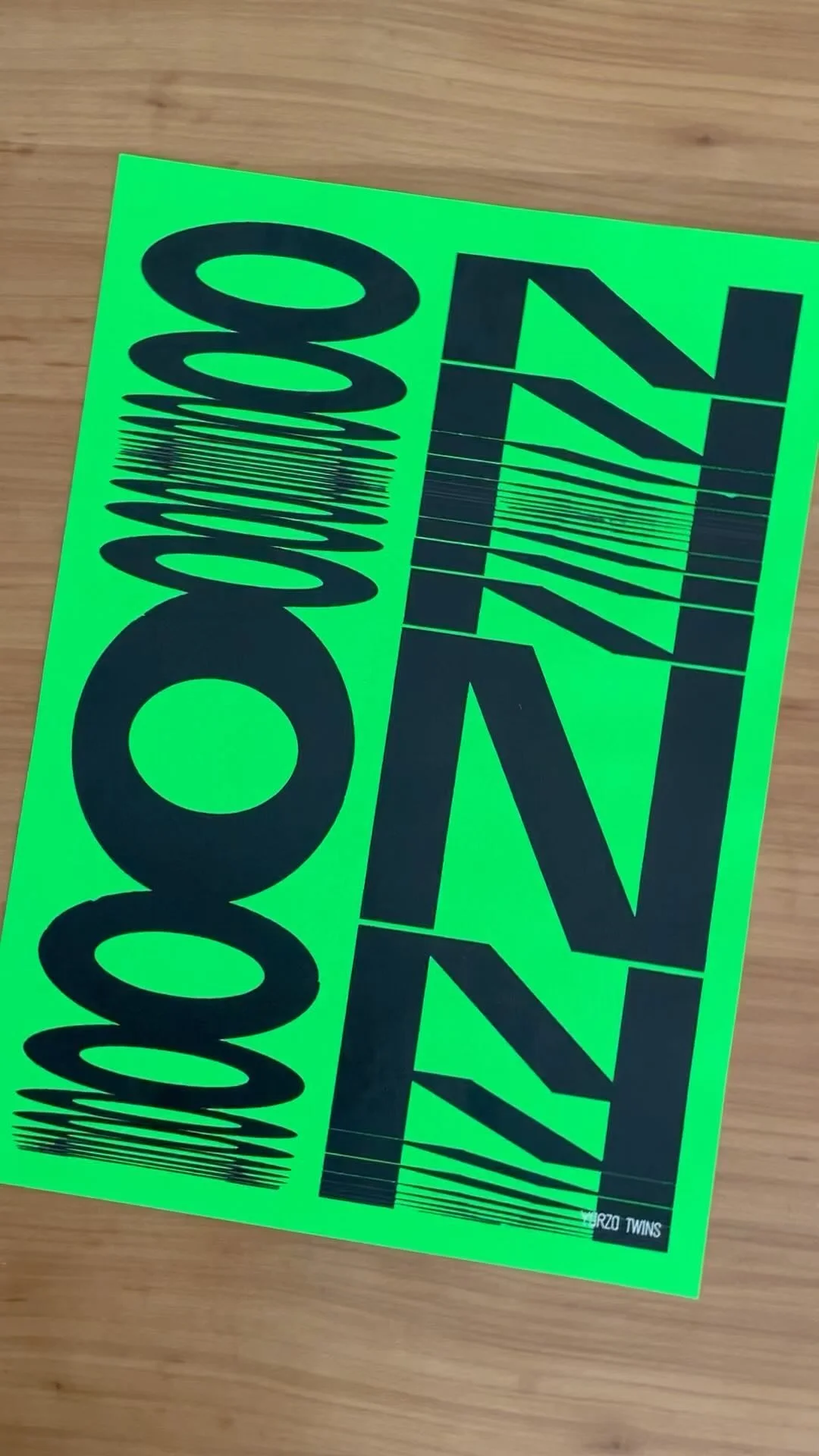
Yarza Twins
Design:
Marta Yarza, Eva Yarza
Packaging:
Yarza Twins
Typography:
Weekend Type, Hamish Makgill
Naming:
Sergio Verillo
Services


Not sure where to start?
Most of our clients begin with Branding or Web and expand from there. We’re here to help you figure out exactly what your brand needs to thrive. We pride ourselves on being adaptable, whether you’re a boutique startup or an established name; we offer scalable solutions designed to fit different goals and budgets without ever compromising on aesthetic quality.
FOLLOW US ON INSTAGRAM