
The mistake behind Coca-Cola’s most recognisable bottle
The story of how an unusual 1915 design brief and a fortunate mix-up between coca and cocoa led to one of the most recognisable pieces of brand design in history.

In 1915, Coca-Cola had a problem.
Its success had brought with it a growing number of imitators. Drinks with names such as Koka-Nola, Toka-Cola and Koke were appearing on the market, often borrowing elements of Coca-Cola’s distinctive script and packaging.
At the time, Coca-Cola was sold in relatively generic straight-sided glass bottles. The logo could distinguish the product, but the bottle itself couldn’t.
So Coca-Cola and its bottlers set an unusual design challenge: create a bottle so distinctive that someone could recognise it by touch in the dark, or identify it from nothing more than its broken pieces on the ground.
It’s difficult to imagine a better brief for designing recognition.
A very fortunate
mistake
Among the glass manufacturers invited to respond was the Root Glass Company in Terre Haute, Indiana.
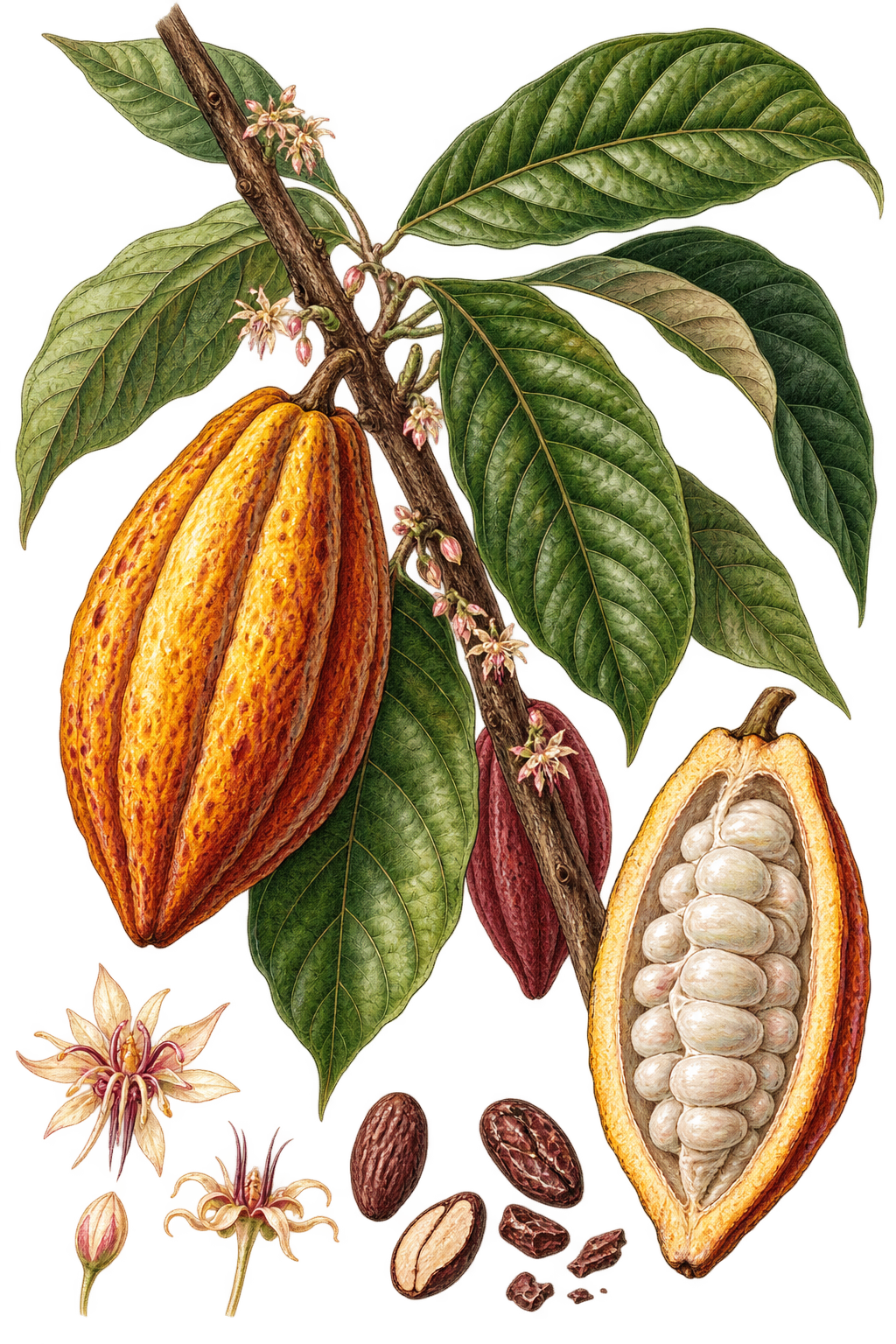
Looking for inspiration, members of the design team went to their local library to research Coca-Cola’s ingredients. They were looking for the coca leaf and kola nut, but instead came across an illustration of a cocoa pod.
Cocoa, of course, has nothing to do with Coca-Cola.
But the mistake gave them exactly what they needed.
The elongated shape of the pod, with its distinctive curves and vertical ribs, became the inspiration for a radically different glass bottle.
The Root Glass Company patented its design in November 1915. The original prototype was slightly too wide and unstable for the existing bottling equipment, so the shape was refined before going into production in 1916.
The result became the Coca-Cola contour bottle.
I find it fascinating that one of the world’s most recognisable bottles was born, in part, from a mistake. It makes me wonder: would our design processes today leave enough room for that mistake to become the idea?
When the object becomes the identity
More than a century later, the interesting thing about the bottle isn’t simply that it became iconic. It’s that it achieved exactly what that original brief asked for.
The brand could be recognised without reading its name.
In fact, by 1949, research found that fewer than 1% of Americans were unable to identify Coca-Cola from the shape of the bottle alone. In 1961, the contour itself was granted trademark status.
There is something very contemporary about a design brief written more than a hundred years ago.
We often talk about brand identity as a collection of visual elements: logo, typography, colour, imagery. But some of the strongest identities extend much further than that.
Identity can live in the shape of an object. In a material. A sound. A movement. A particular way of constructing something.
The Coca-Cola bottle is an extreme example, but the question behind it is still a useful one when designing a brand today:
If we removed the name, would we still know who it was?