
Branding for a Cannabis Company
Brand Design, Logo Design, Brand Book, Merch
Ration is a US-based cannabis brand with a clear mission: to give back. They partner with everyday heroes such as military veterans, active-duty personnel, firefighters and nurses, and donate 5% of net profits to non-profits with meaningful impact. Their motto sums it up: “Do good. Feel good.”
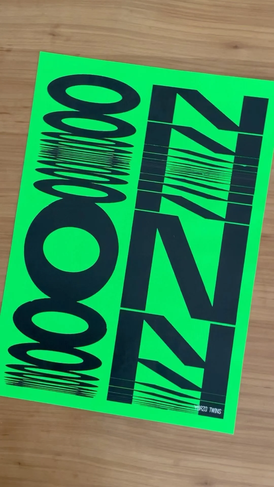
Together with Born and Bred, we developed Ration’s visual identity. Inspired by US military memorabilia, we designed a logo influenced by 1950s American commercial typefaces and the rectangular shape of military name tags.
The packaging, created for both endura and jerky formats, reflects the same straightforward, utilitarian spirit while remaining distinctive and memorable.
Ration shows how branding can combine purpose and design, creating a product that supports a cause while standing out on the shelf.


Credits
Strategy:
Born and Bred
Design:
Yarza Twins
Naming:
Chris Michaud
Services

Not sure where to start?
Most of our clients begin with Branding or Web and expand from there. We’re here to help you figure out exactly what your brand needs to thrive. We pride ourselves on being adaptable, whether you’re a boutique startup or an established name; we offer scalable solutions designed to fit different goals and budgets without ever compromising on aesthetic quality.
FOLLOW US ON INSTAGRAM